A series devoted to photographers working within music.
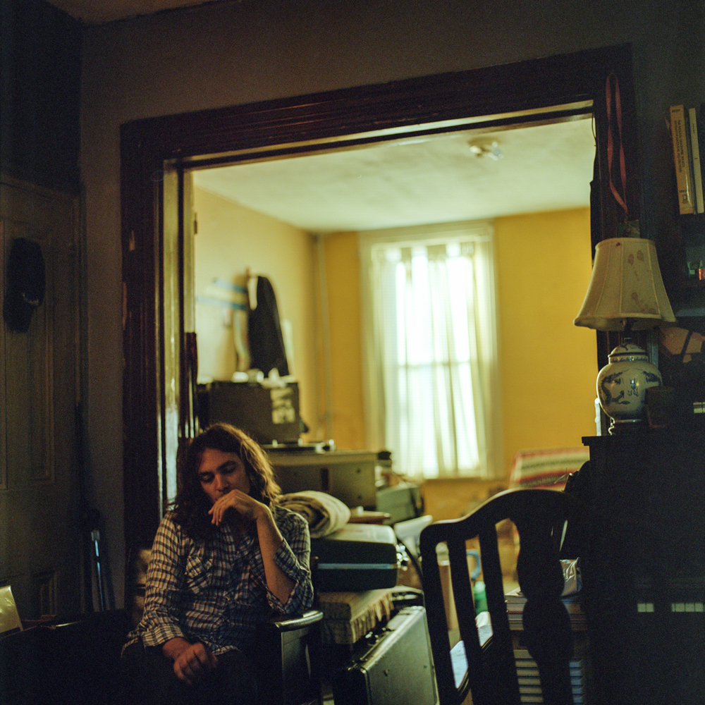
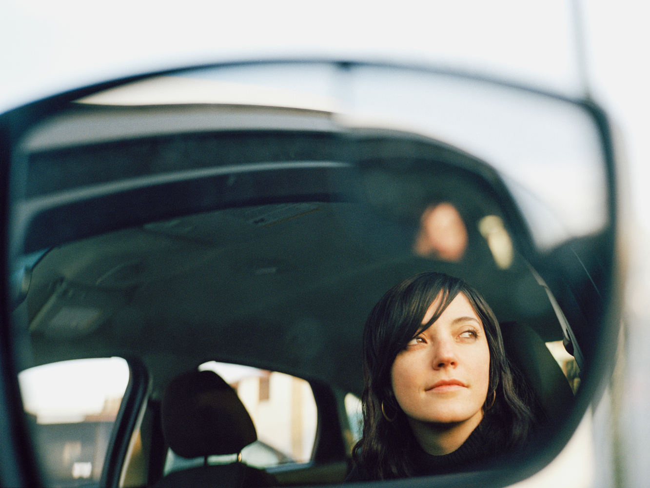
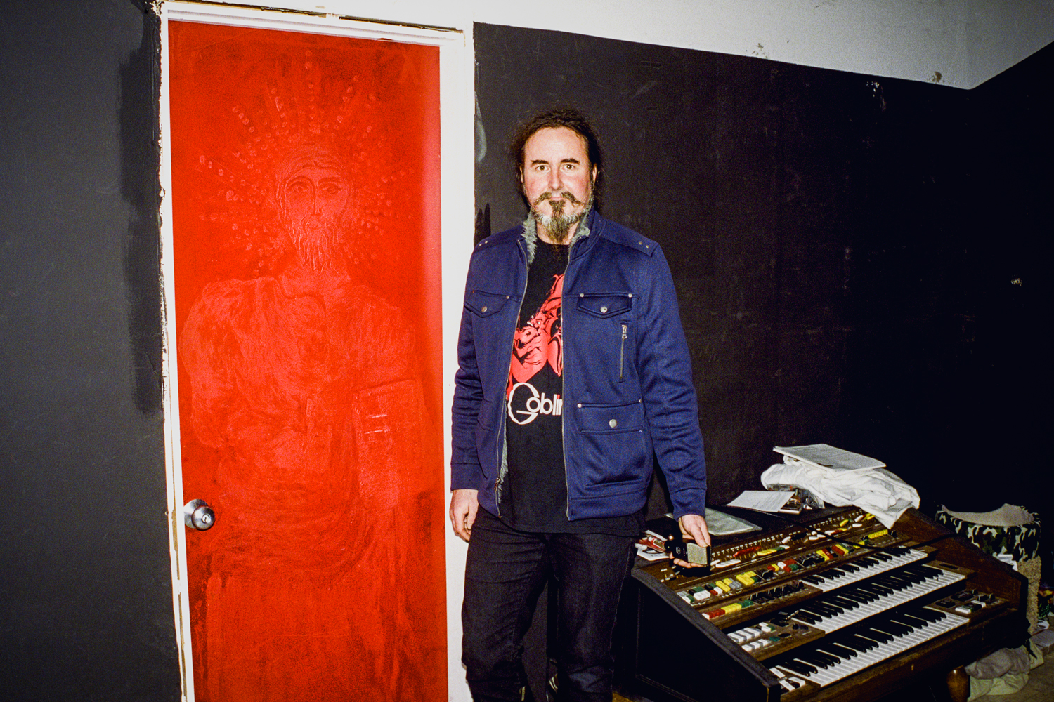
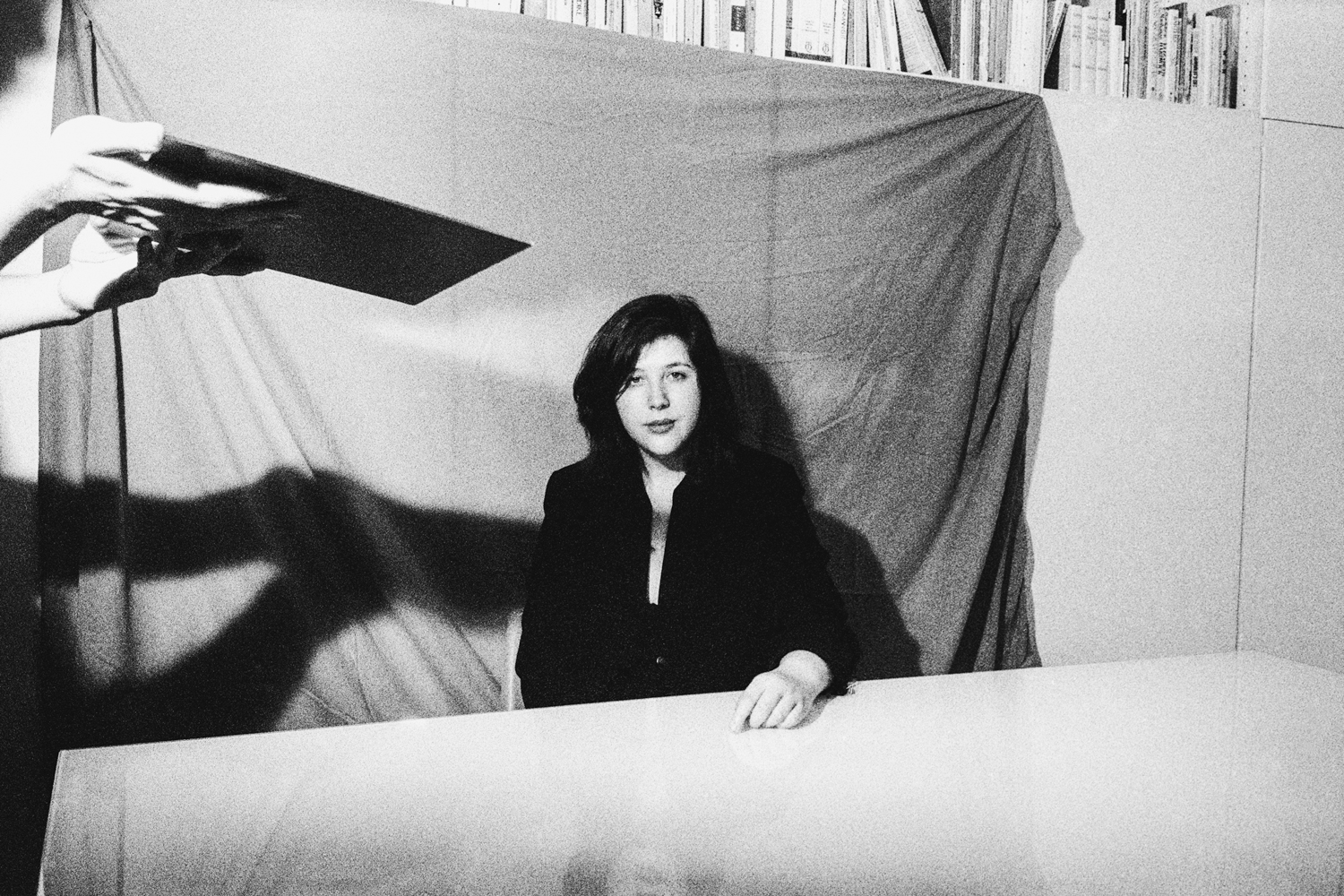
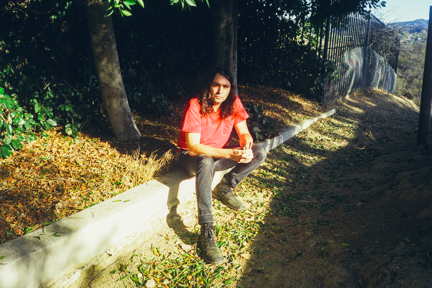
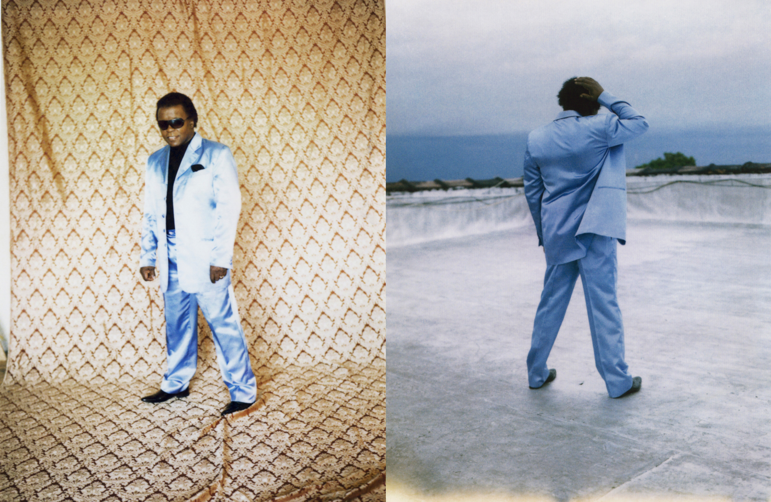
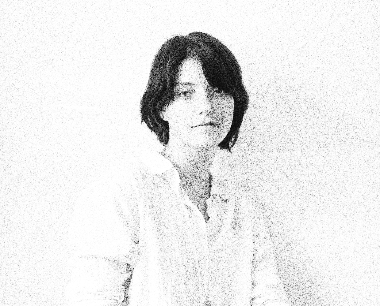
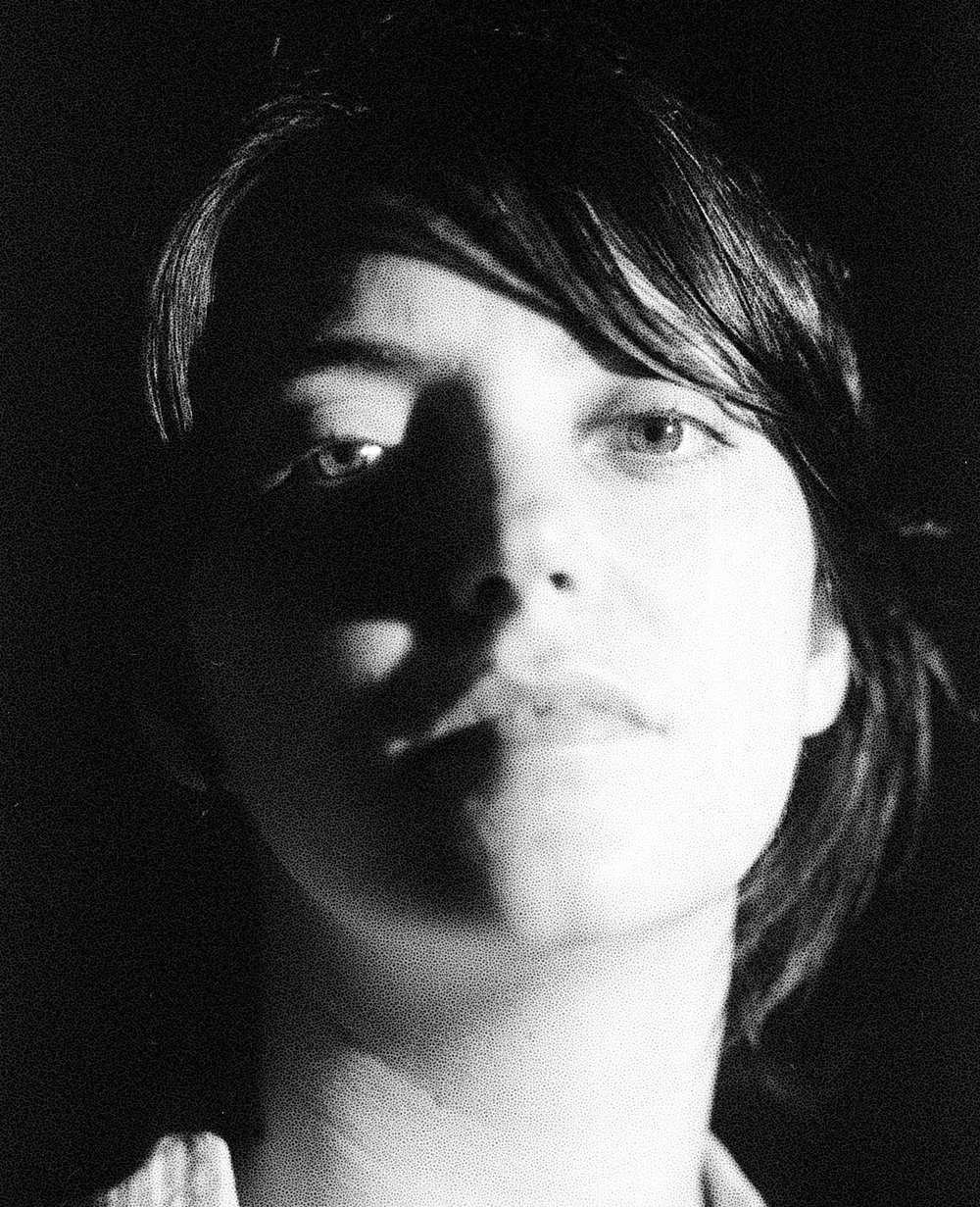
Dustin Condren understands the art of translation. Academically, that revolves around language. Fluent in Russian (with five other languages under his belt) Condren's spent more than a decade studying Slavic Languages (he's currently a PhD candidate at Stanford), and has translated published works such as Leo Tolstoy's “The Gospel in Brief.” Condren also has a keen eye for another kind of translation; music photography. He's captured portraits and album covers for artists like Kevin Morby, The War On Drugs, Sharon Van Etten, and Phosphorescent. Even with its subtlety and illumination of the artists, the images feel like Condren’s. His portraits often seem like natural, normal moments caught off-hand, slightly saturated and dipped in a melancholy, like the light and mood found at the end of a long day. Majestic Journal had a chance to chat with Condren about his affinity for working in music and finding common ground with an artist's vision (while he took a quick break from writing his dissertation).
The War On Drugs - Secretly Canadian
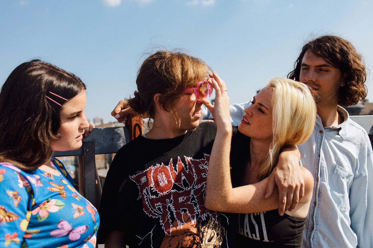
Young M.A. - Loud & Quite
Jessica Walsh - Design Bureau, Dustin Condren
Your life is very academically focused. I was curious how working with musicians fits into that now and when that began?
When I first started taking pictures, I'd done three years of grad school studying Russian literature and was getting really overwhelmed with being in the library all the time, studying dead people, and not really feeling like I was participating in much of anything. Around that time—my focus in Russian Literature was theater and film—my interest in theater led me to start directing plays. I started taking pictures of my actors, and that turned into portraiture. People started responding to my portraits online, then I got lucky by meeting Sharon Van Etten. We started talking about taking pictures a lot. We kind of grew together, and then, when she signed with Jagjaguwar, she sort of brought me on as her photographer.
Sharon Van Etten
“... whether or not photography existed, I would still be following music intensely”
Sharon Van Etten
I find it so interesting that your work includes translating, because it seems like so much of photography in general obviously is a translation, but specifically working with musicians, taking another artist's image, and translating that, becoming a medium for that.
That's a nice connection. I tried different venues for photography when I was first starting out; I did fashion, gallery oriented art-photography, but music was the thing that sort of landed for me. Like you're saying, most of photography is connected to this other thing, whether it's publishing, or music, or fashion; it's usually vehicles through which other things travel. Music was and always has been this thing I care about deeply, whether or not photography existed, I would still be following music intensely. As a practicing photographer, the question is, what do you do with the musician to translate? It's different in every context and that's what's so exciting about it. There's just so many different levels on which artists approach not only how they want to represent themselves, but the level of reality and theatricality they want involved.
Unknown Mortal Orchestra - Jagjaguwar
Album art is even takes this a step further, because it really is the representation of those songs. I was wondering if you have a process / technique for balancing your own aesthetic with the artist's vision, or if your aesthetic is just inherent to your work?
Usually an artist has a pretty specific idea of what they want. My favorite method really is to have a vague idea, and then to get to spend two to three days with someone make a ton of photos, and see what happens.
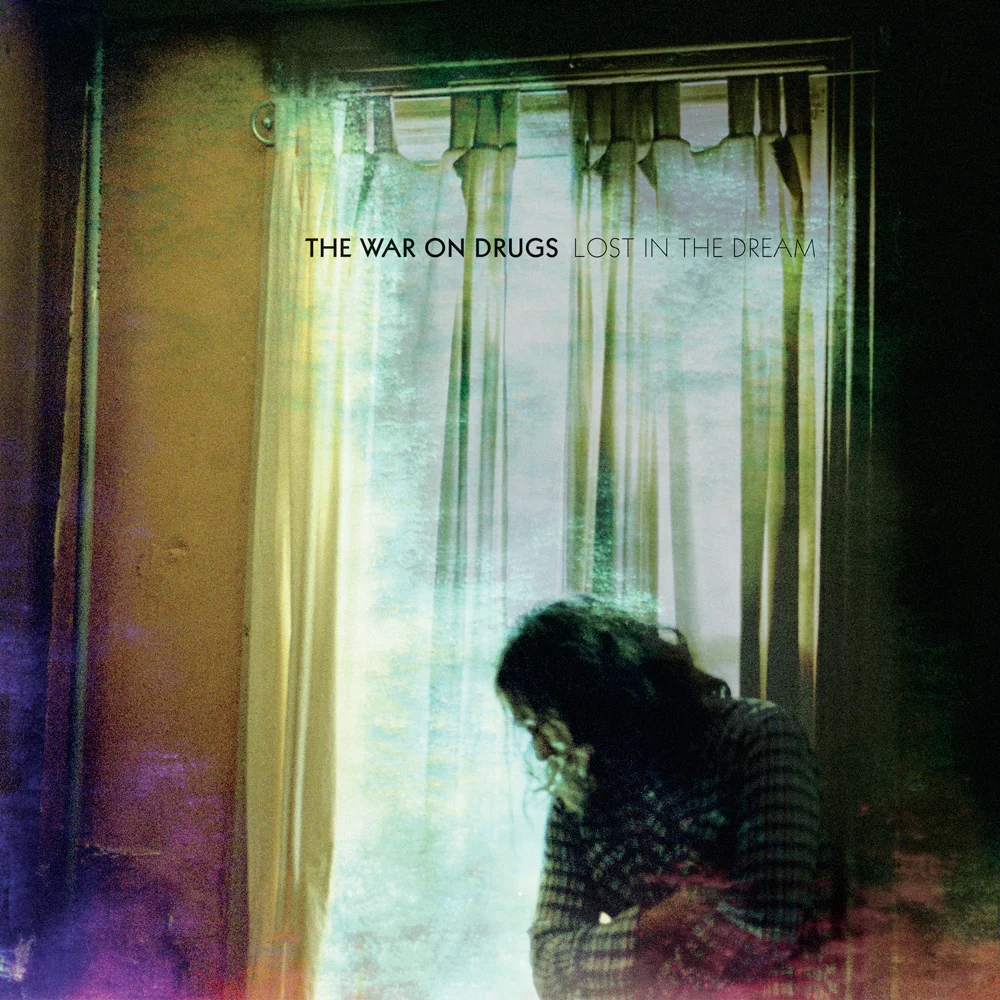
The War On Drugs - Lost In A Dream
Is there a cover that really stands out according to you, that feels like a really cohesive vision with the artist?
The one that really worked as a collaboration was the “Lost In A Dream” cover for The War On Drugs. It was that sort of situation, hanging out with Adam [Granduciel] for three days in his house, taking pictures around Philadelphia. The earlier albums featured these light-leak images that Adam had shot while on tour. He doesn't know how to use his camera very well, so he just liked the mistakes he made. While we were shooting, we talked about layering two images on top of one another. I shot a ton of portraits of him—this was the first time he'd really appeared on any of the artwork—so he was a little hesitant. We wound up choosing an image where he's turned away from the camera. With that image which was very saturated and hazy, we laid one of his photographs, so it’s like a double-exposure. Because it was such a successful record I've gotten plenty of attention for the cover, but Adam himself as a photographer was a big part of it as well. We came up with the idea together, and he took half of the picture.
Follow Dustin Condren:
Instagram
Written by Robin Bacior
Edited by Amelie Varzi


